Brand Colors
PMS 288 (the flagship University Health blue) should be the main focus of color for design pieces.
The accent palette should serve to delineate sections, such as in a headline or subhead. These colors can also be utilized when creating infographics, charts or graphs.
Primary Palette

PMS 288
CMYK: 100/80/6/32
RGB: 4/54/115
HEX: 002d74

PMS 7467
CMYK: 97/0/30/0
RGB: 0/173/181
HEX: 00adb5

Cool Gray 9
CMYK: 56/47/44/10
RGB: 118/119/122
HEX: 76777b
Accent Palette

PMS 171
CMYK: 0/79/81/0
RGB: 255/92/53
HEX: ff5c36

PMS 143
CMYK: 3/32/91/0
RGB: 245/179/53
HEX: f6b436

PMS 3385
CMYK: 62/0/44/0
RGB: 59/212/174
HEX: 3cd5af
A bright accent palette provides a pop of color that feels modern and dynamic. Our palette is inspired by San Antonio landmarks such as the orange-red “La Antorcha de la Amistad” and the yellow-tan bricks of the Alamo.

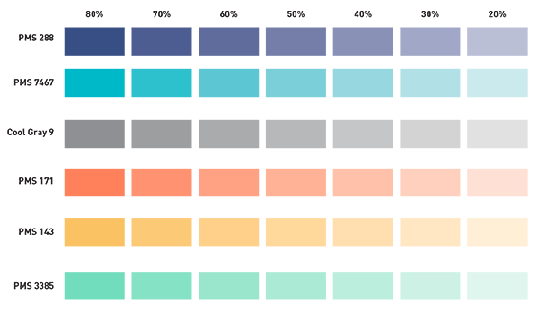
Colors may be screened to add visual variety to a design.
In order to maintain a cohesive look for our brand, additional colors outside of the official palette should not be used in any marketing communications. Additional colors may be used in special circumstances, with prior approval from Corporate Communications & Marketing.